Amaretto Adriatico
Branding : Le Fruit Studio
Art Direction : Le Fruit Studio
Packshots : Théo Prest
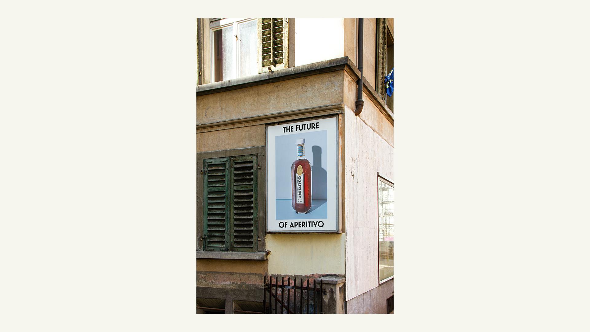
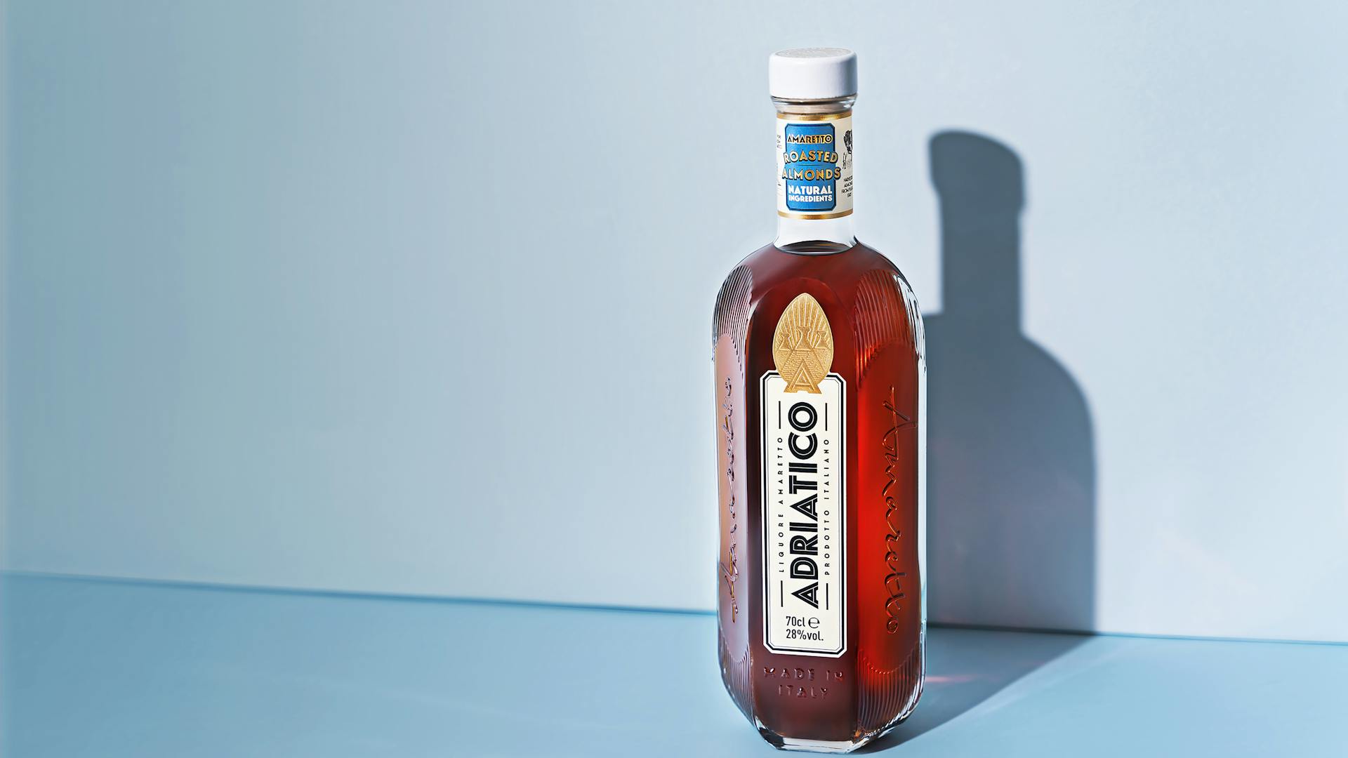
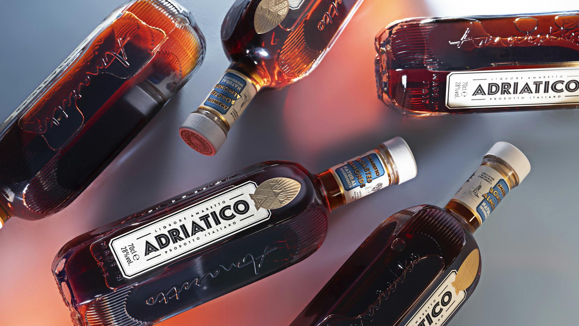
The Adriatico project was born from the ambition to modernize the amaretto. Considered an unrefined and overly sweet liqueur, Adriatico offers a revisited recipe, made from real Apulian almonds roasted and salted with salt from the Adriatic Sea. The challenge was to create a contemporary brand that proudly asserts its references to Italian industrial design from the 1950s, and to give the bottle a status dimension while retaining a sense of movement.
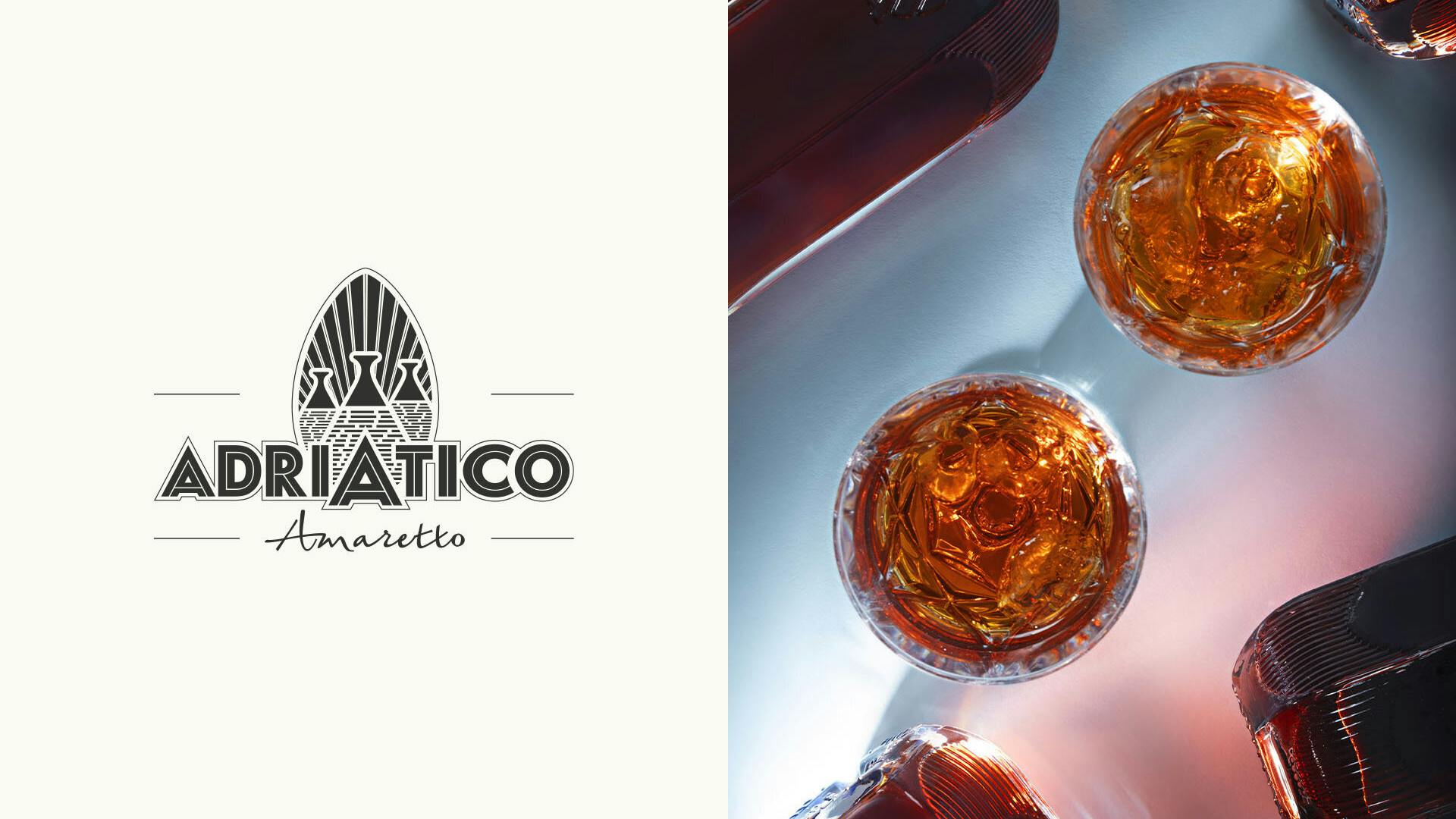
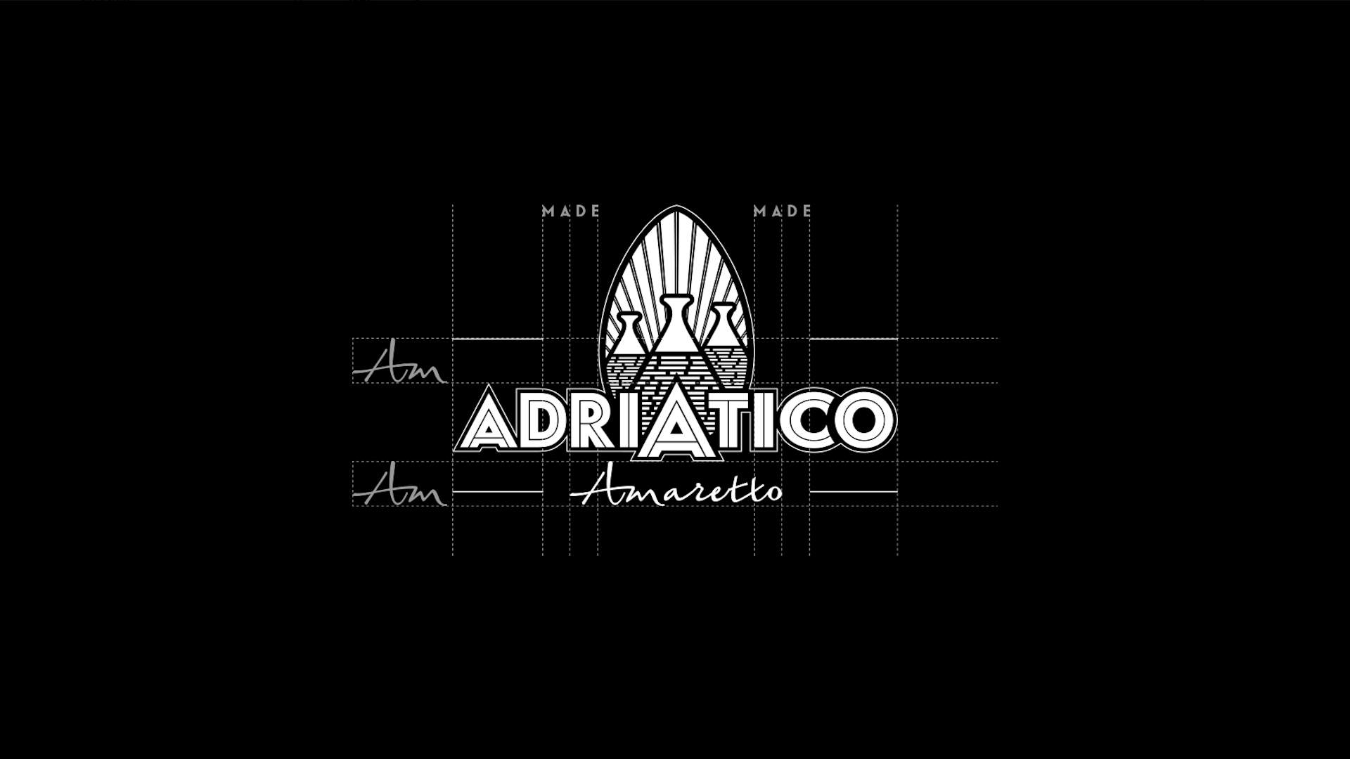
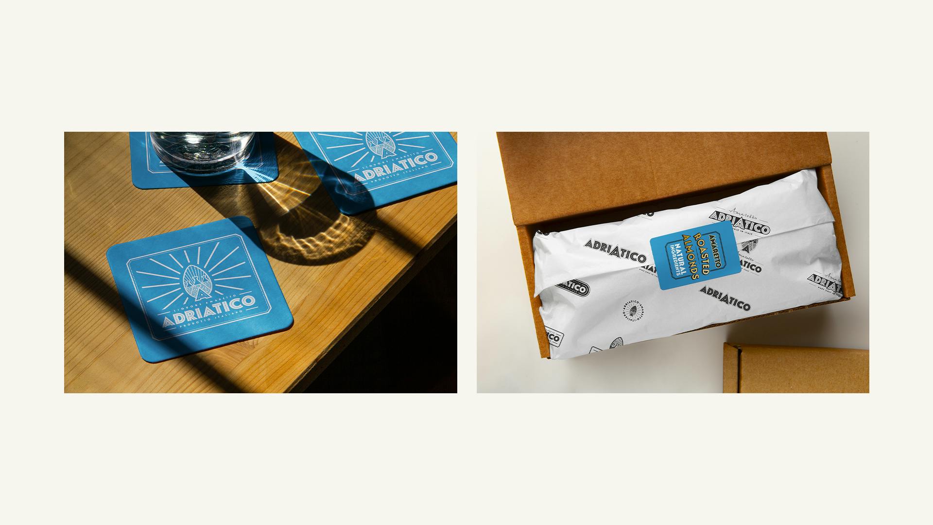
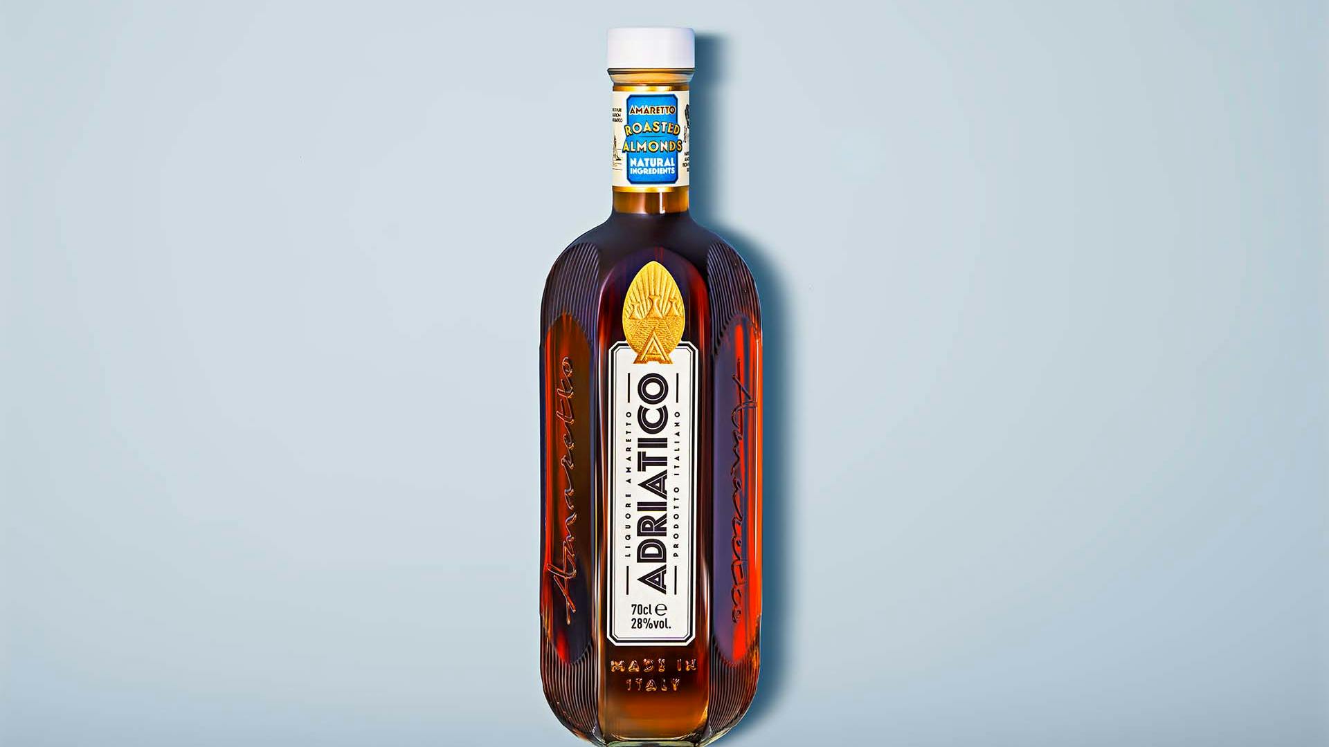
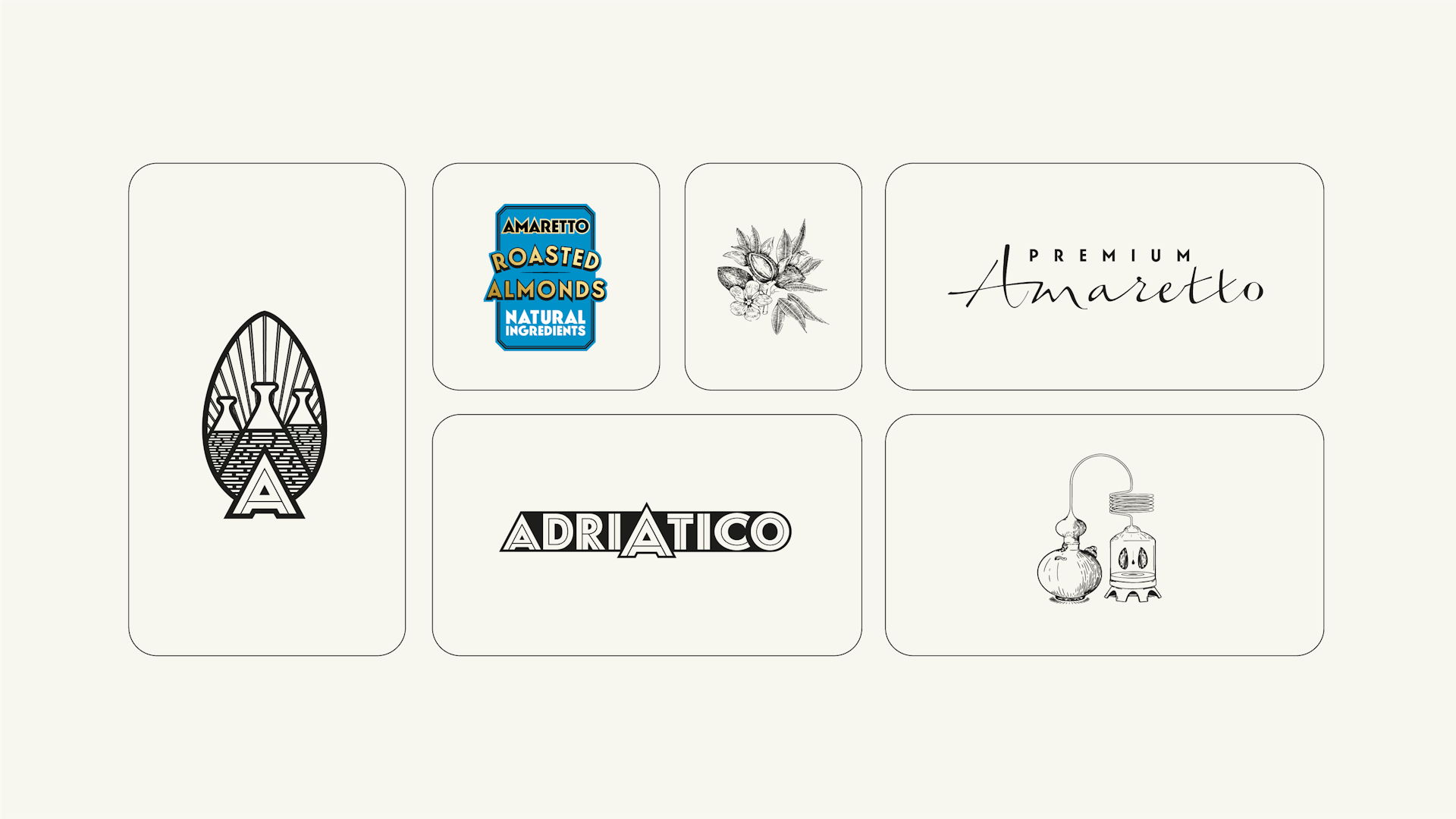
The logo brings together the symbols that make up the brand's DNA: 3 trulli and solar radiation encircled in an almond embedded in an A.
Our work on the logo focused on a search for symmetry and elevation to give it an iconic dimension.
Numerous variations were born from our research, which allowed us to produce a significant quantity of secondary logos adaptable to all uses of the brand and enriching its language.
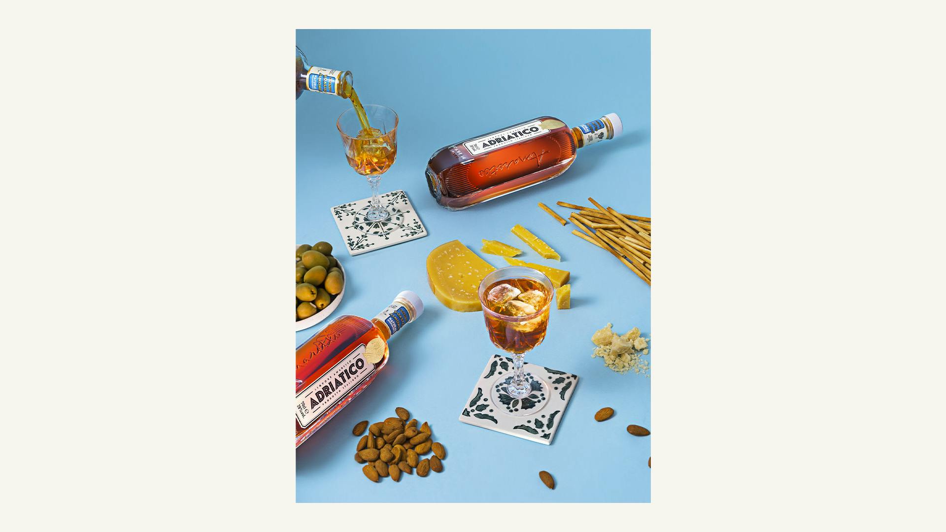
L’Amaretto qui met les spiritueux à l’amende !
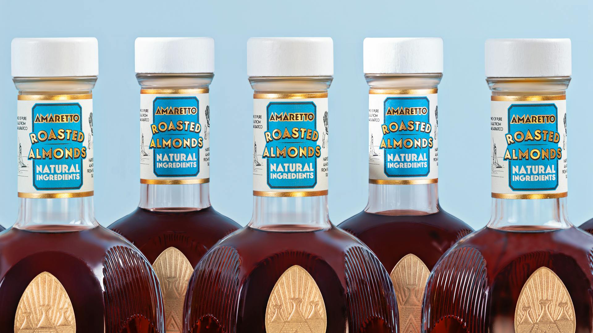
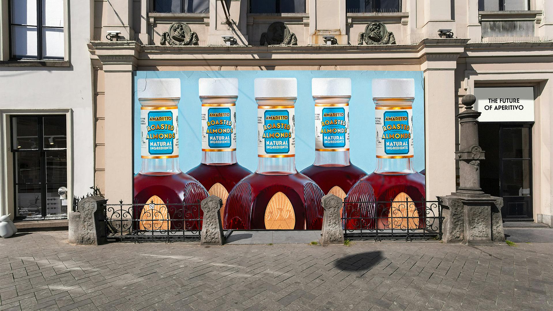
The shoulders of the bottle are topped with a long and elegant neck, around which a collar is wrapped. In its center is a blue label inspired by the Adriatic Sea, on which Roasted Almonds is written in gold letters.
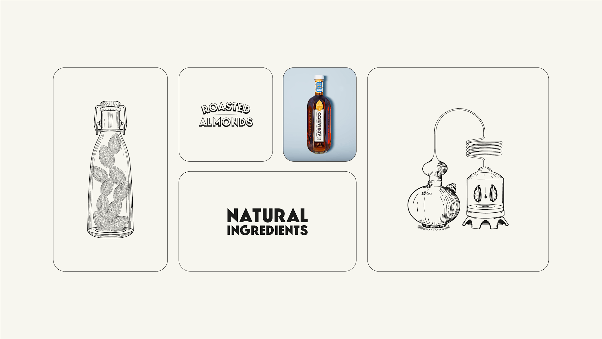
A series of 4 illustrations inspired by the engravings highlights the recipe and ingredients of amaretto Adriatico. These elements enrich Adriatico's graphic vocabulary and highlight the craft dimension of the brand.
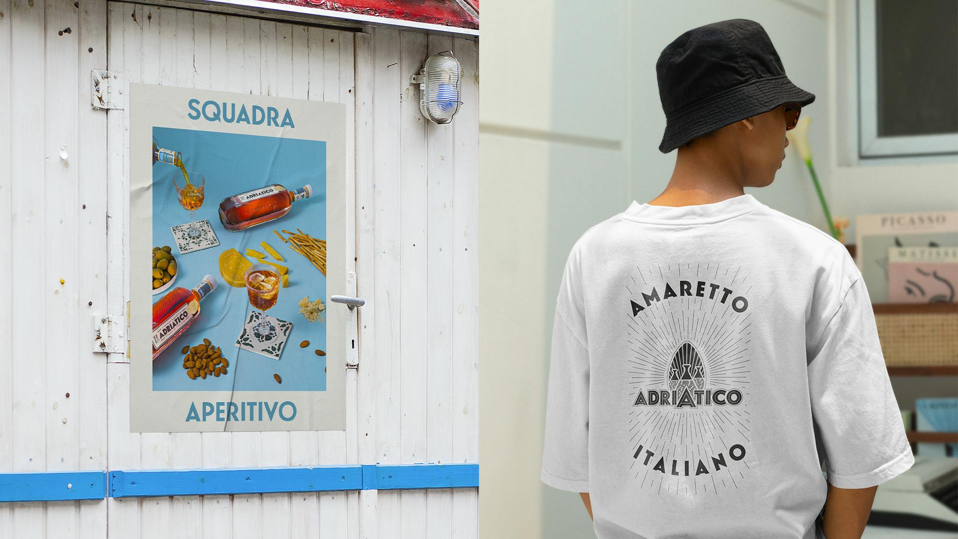
Create a modern and culturally timeless brand.
